A depiction of a login form for a website

Password Management: We’re doing it wrong

Raise a hand for each of the following that you’ve done:

  1. Kept track of passwords on scrap paper or notebook
  2. Kept track of passwords in a spreadsheet
  3. Forgot to update your notebook or spreadsheet when a password changed
  4. Used the same password, or variation of the same password, for multiple logins
  5. Used a weak password, like real words with some numbers in it. h0wAb0utTh1s! (yes, this is a weak password!)

Did you run out of hands to raise?

You are not alone! Many of us, myself included, have done all of the above.

Most people are bad are managing passwords because we’re not computers. Or at least, not computers in the way that allow us to randomly generate and remember long strings of random characters!

Enter Password Management Tools

We all know that passwords are a giant hassle. They can be impossible to remember and difficult to organize. And because it’s so difficult, we often end up using weak passwords that are easy to hack. We’re doing it wrong.

Thankfully, many years ago I discovered free password managers like LastPass*, and I went frolicking through the hills like Julie Andrews in The Sound of Music.

Actress Julie Andrews with arms outstretched in the film The Sound of Music with the caption Me discovering password management
Me (a name, I call myself)… upon discovering the existence of password managers like LastPass circa 2012-ish

Ok, How does it work?

LastPass, 1Password, and other password managers remember your passwords in an online vault. I’m most familiar with LastPass, so here’s how it works:

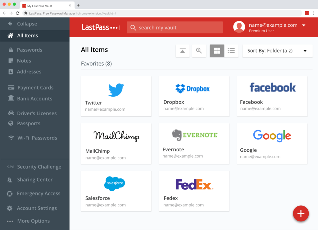
As you go about your day and log in to your favorite websites, LastPass remembers each password for you and collects them into an online vault which you can access by clicking a button. When you need to make a new login on a website, LastPass can automatically generate a strong password for you and then store it, so you never have to record it yourself. It can also remember information like addresses and even credit cards (only if you choose) to save you time when making online orders.

All you have to do is remember your one master password to access your vault. That’s it. One password to rule them all!

Oh, and it also makes it super easy to securely share your password with others. And…it works on all devices. And it’s free. Pretty awesome, right?!

A screenshot of the password vault by LastPass
The Vault! Screenshot by LastPass

Is it Secure?

I’ve told countless people about password managers because it’s made my online life easier, and I’m often asked if the service is secure. “What if the password management service is hacked?” you ask. It’s an important concern.

A password management company has a huge investment into security, because their entire business model relies on it. Which is more secure: their system, or my “system” of using weak passwords? Probably their system. Ok, definitely their system. To read more of a technical explanation of how LastPass stores your passwords securely, check out this page: How It Works.

For me, the daily benefits and time-saving sanity of LastPass — which I’ve used for upwards of 7 years — vastly outweighs the possibility of my vault being comprised (in which case I could still control access by resetting my master password).

What about letting Chrome/Safari/Firefox remember all my passwords?

There’s nothing wrong with using this method, except that it can encourage the weak password habits we talked about above.

If you need help generating strong passwords, check out this generator you can use for free: https://www.lastpass.com/password-generator

(I’ve also found that most people don’t know how to view their saved passwords – Here’s how to sync and retrieve your passwords in Google Chrome.)

“81% of hacking-related breaches leveraged either stolen and/or weak passwords.”

– Verizon Data Breach Investigations Report, 2017

Follow these Two Rules for Password Success

It doesn’t matter what tool or method you use to manage your passwords, as long as you follow these two rules:

  1. Use a unique password for every. single. login.
    Let me repeat that.
    Use a 100% unique password (not a variation) for every single website.
  2. Use a strong password – that means random letters and numbers, or a random string of words, of 12-16 characters.
    Example: 9Bm!Te@MEti5

If you can do that with a notebook or a web browser, more power to you. For the rest of us humans, there are password managers.

PS – If you liked this, check out my post on Online Tools to Save Time and Stay Organized which I recently updated.


*This post uses an affiliate link to LastPass, but I am not paid. I think I get a free trial of their premium service? Let’s find out, sign up already! 😀

I'm Moving to Nevada

I’m Moving!

After months of planning, I am moving this summer to Las Vegas, Nevada. I’ve gathered up the basics of the big move here, and what it means for business going forward.

Why now?
Moving out west has been a dream for many, many years. After nearly 15 in Asheville, my husband’s job began to allow for 100% remote work. He is a programmer, so this change gives us both a unique opportunity to work from anywhere.

Why Vegas?!
Despite the *very* hot weather, Las Vegas is an ideal location for exploring the canyons, mountains, and deserts of the southwest. I know many of you have been to this area and fallen in love with it, too. We’re excited to use Vegas as a home base for working, hiking, and sight seeing. And with clear weather and tons of flights, it’s a good city to be able to fly quickly back to NC for a visit, too!

On the road to Great Basin National Park in 2017. Route 50 is the “loneliest road” in America.

What about Lydia Roberts Design?
Never fear, Lydia Roberts Design is here to stay. Although I’ll be on Pacific Time (3 hours behind the east coast), it will be business as usual. I will fully support all my Asheville clients from afar. I’m always up for video calls so we can still see each other. The Asheville community is near and dear to my heart, and I will make visits and keep up with happenings in the 828.

Will you still work with Asheville clients?
Yes! I would very much like to keep working with Asheville-based businesses both new and old.

Will you move back?
As with anything in life, nothing is certain. But, since most of our friends and family are in NC, I imagine we’ll make our way back at some point in the future!

Lydia sits behind her laptop and smiles
I’ll be where you can find me – behind my computer screen!

My deepest thanks to all of you who have supported me all these years. I look forward to many more years of building fun things on the web together!

PS- If you’re a photo or travel junkie, feel free to follow along with my western adventures on Instagram @leaflyd and @lydiarobertsdesign


Frequently Asked Quetions

Why your website needs a FAQ page

The purpose of a Frequently Asked Questions (FAQ) page is to allow easy access to all the vital information about your business. It allows potential customers to start trusting you, buying from you, or contacting you. I recommend every site have one, and here’s why:

A FAQ page saves you time

Customers are happy to find the answer they need quickly, and you won’t waste valuable time responding to an email or phone call about a very basic question.

  • “Do you deliver?”
  • “Are tours held when it’s raining?”
  • “What are your hours?”
  • “How do I register for the workshop?”

Basic logistical questions like these should be answered clearly on your FAQ page. Save time by answering these frequently asked questions on your website, so you can connect with your customers and answer the more detailed questions that lead to sales, inquiries, and relationships.

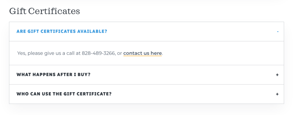
Here’s an example of what your FAQ page can look like with an expand-able area for each question:

An example of an expandable FAQ section

A FAQ page is a marketing tool

Just because a FAQ page might reduce the number of basic requests, you can choose how much information to share in order to get more focused requests.

For example, if you prefer to discuss rates or pricing with clients after you make contact with them, consider putting a question related to pricing, but answer it with something like this:

“Our prices start at $X. For a custom quote, please contact us” (insert link to your contact page, or include your phone number and email here).

You can also use the FAQ page to reduce requests from people who aren’t a good fit as a customer.

If your retreat venue is ideal for group yoga retreats, and you don’t want it used a wedding venue, add some questions related to weddings & events and make it clear you do not book weddings or receptions.

A FAQ page is great for search engines

Anything that helps with the user experience — the way people interact with and use your website — is a good thing! A FAQ page is great for user experience because it helps people find valuable information quickly and reduces frustration. Google and other search engines see this as a positive sign, and since your FAQ page contains lots of information about your business, it can be a great place for Google to find keywords about what you do.

Tips for FAQ pages:

Make a note when you receive customer questions

As you receive questions from customers, write them down or ask staff to make a note. This will make it easier to write your FAQ page and keep it updated. For the detail oriented, you might even list questions in a spreadsheet and mark down how many times each question was asked in a month. This will tell you what the burning, need-to-know questions are vs. the less important one-off questions.

Revisit your FAQ page every 3-6 months and update it

Your business changes over time. Perhaps you add a new service, product, procedure, or even change location. Make sure your FAQ are up to date and reflect the questions and issues that matter now.

Place your FAQ page in your main menu

You might be tempted to put the link to your FAQ page in the footer or link to it from a subpage of your site. But, the best way for people to find the page is by putting a link front and center in your main menu, at the top of your site. This also helps mobile users find it quickly.

Put a call to action on your FAQ page

Use your FAQ page as an opportunity to capture people right when they get all their questions answered and are ready to engage with you.

After each relevant question, or at the bottom of the page, put a call to action. A call to action could be “Have a question we didn’t answer? Contact us now” or “Workshops are offered weekly but fill up quickly! Register Now”

An example of a call to action from Eating Asheville, a food tour company. It says Hungry for a taste of asheville with a button to book a tour.
Example of a call to action block at the end of a FAQ page

My favorite FAQ plugin

I often use the Genesis theme framework, and the Genesis Simple FAQ plugin is one of my favorite plugins. It displays your questions and answers in a nice show/hide format that looks professional and clean. It allows you categorize your FAQs. You can then insert the categories onto your FAQ page, and insert specific categories across your other pages. Here’s a nice tutorial from Studiopress.

For example, on the Eating Asheville website, one category is for questions related to Gift Certificates. I also included these questions on the Gift Certificates page, so it’s easy for people to get all the information in one place.

Gift certifcate frequently asked questions
Frequently asked questions for the Gift Certificates category can appear on multiple pages

Because the plugin has a central area for updating the FAQ, you only need update it once, and any page where the question appears will be automatically updated. Another great time saver!

I hope these tips help you as your write your new website, or maintain your existing one!

Gutenberg Revisited

Gutenberg — the new block editor from WordPress — was released in late 2018. I’ve now had the opportunity use it on several sites, and these are my initial thoughts about it. Please note this post is more designer/developer focused. For more of a general overview about the block editor, please read my previous post, Here Comes Gutenberg.

What I Like about Blocks…

Columns
Layouts that previously would have required a custom template can now be created in minutes. The primary example is the columns block. I especially love being able to use columns at will without resorting to customizing a child theme or creating a special page template.

con: The columns appear very narrow in the editor and it can be hard to drag blocks in and out of the column areas. If you use a bullet list inside columns, it starts to look pretty bad in the editor because there is not enough width to show the text without wrapping. All the content is smushed together.

Galleries
The gallery block is really nice. I like that it can be adjusted just like the old WordPress gallery to be multi- or single-column, link to the images or not. It’s a nicer visual representation of what the gallery actually looks like, whereas in the classic editor, it could often look nothing like the real gallery depending on the theme.

con: You need to install a plugin like WP Featherlight to make the images pop up in a lightbox when clicked, as far as I can tell. It would be nice if this was just built in to the gallery block as an option to turn on or off.

HTML block
As a developer it’s amazing to have a block just to insert custom code, if I need to add a very specific area to a page that needs to look “just so”, or maybe I need to insert a widget from a third party in javascript. Previously, this was a big problem because custom code could be hidden or easily edited/overwritten in the visual editor. This way it’s more protected and separate.

con: I’ve noticed several times that if invalid HTML is detected, the block shows a warning and allows you to expand a window showing the errors. The interface for fixing the html is super confusing and reminds me of the draft history interface, where nothing seems to be editable. I might be missing something here, but so far this has thrown me for a loop.

Classes
Possibly my favorite feature is the ability to add css classes on any block, in the Advanced area. Like the HTML block, this allows me as a designer to add specific styles to headings, paragraphs, or really any other area, without it being in danger of getting lost when the text is edited.

Re-usable Blocks
I haven’t used this nearly as much as I thought I would, but I still love that it is an option.

Pet Peeves

The way inline images work is just plain confusing, and I’m not sure I “get it” enough to even write much about it here. This was one of the most useful features of the old editor, so to see it degrade here is really unfortunate. Inline doesn’t gel very well with blocks, and it seems like once an image is inserted inline, it can’t be edited, only removed. What am I missing here?

A lot of the UI (user interface) elements don’t show up until you hover or click inside of a block. This is kind of cool, because it makes the whole view cleaner as you’re working. But it also makes it really hard to delete a block – you have to click in the block, click again on a three dots for “more” and then “Remove Block”. It can make deleting something simple like a button take way longer than I feel it should.

The whole editing window is much narrower than the classic editor. I think this is because some themes allow for full width images/content areas, so it helps show the difference between the normal width (narrow) and full width (wide). But many themes don’t have this ability and it’s annoying that the editor can’t be adjusted to be wider. See my above comment about how columns appear smushed together because they are so narrow.

Thumbs up for now

Overall, I think Gutenberg is a big step in the right direction, and it was needed. The ability to use columns alone, without a plugin, is huge.

There is definitely great room for improvement, but I’m already looking forward to updating existing sites to use more of Gutenberg and less of custom fields or plugins that are becoming obsolete. It’s already changed the way I think of laying out pages, and is making building a site easier and more flexible.

How to Remove Spam Comments

Ever wonder how to get rid of spam comments all in one go? Here are a couple of methods you can use to clean up your WordPress comments.

Reminder: it’s always a good idea to take a backup of your site before doing anything major like deleting comments, just in case you change your mind or accidentally delete real comments and not just spammy ones.

Use a Plugin

If you’ve let dozens, hundreds, or even thousands of comments (yes, it can happen) accumulate on your site, a quick way to get rid of them is by installing a plugin like Delete All Comments.

Here’s what to do:

Go to Plugins in your WordPress dashboard and click “Add New.”

Search for “Delete All Comments.” Install the plugin and Activate it.

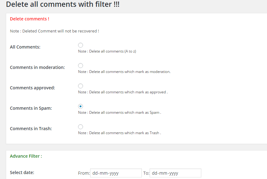
Then, go to Tools > Delete Comments. Check the radio button for “Delete all comments which mark as Spam” and click Delete Now.

Delete all comments plugin settings screenshot

Voila! Your site is all fresh and clean. Make sure you adjust your Discussion settings to prevent future spam comments – skip to instructions.

Advanced: Delete with Database Command

Feeling techy? It’s easy to delete unapproved comments directly through phpMyAdmin. If you don’t know what that is, do not attempt this method! This is for advanced users only.

Here’s what to do:

The way to delete spam comments through phpMyAdmin is to delete the comments that have not yet been approved. If you have spam comments that have already been approved, you will need to use another method. Before doing this method, make sure you approve any non-spam comments.

Log in to phpMyAdmin.

Make a backup of your database just in case.

Look for the phpMyAdmin icon (under databases) and click on it. You should see a page like that when you are in the phpMyAdmin page

Select your WordPress database by clicking on it on the left. You will see a list of tables within that database.

Next, locate the tabs on the right side, and find “SQL”. Click on that.

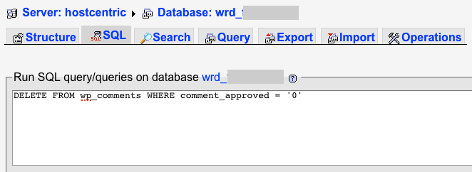
Run the Following SQL command on your database:

DELETE FROM wp_comments WHERE comment_approved = '0'
Screenshot of phpMyAdmin running an SQL command
Advanced users can use this method to remove unapproved comments directly in the database through phpMyAdmin

Click ok on the “do you really want to… DELETE FROM…” message popup

You should see a status message saying something like “153 rows affected”. The number of rows will vary with how many comments were removed.

Log back in to your WordPress admin panel, and you will find all the pending comments gone! Hurray!

Adjust Settings to Prevent Spam Comments

Now that your website is squeaky clean and rid of spam, let’s make sure it doesn’t happen again!

Option 1: Turn off comments
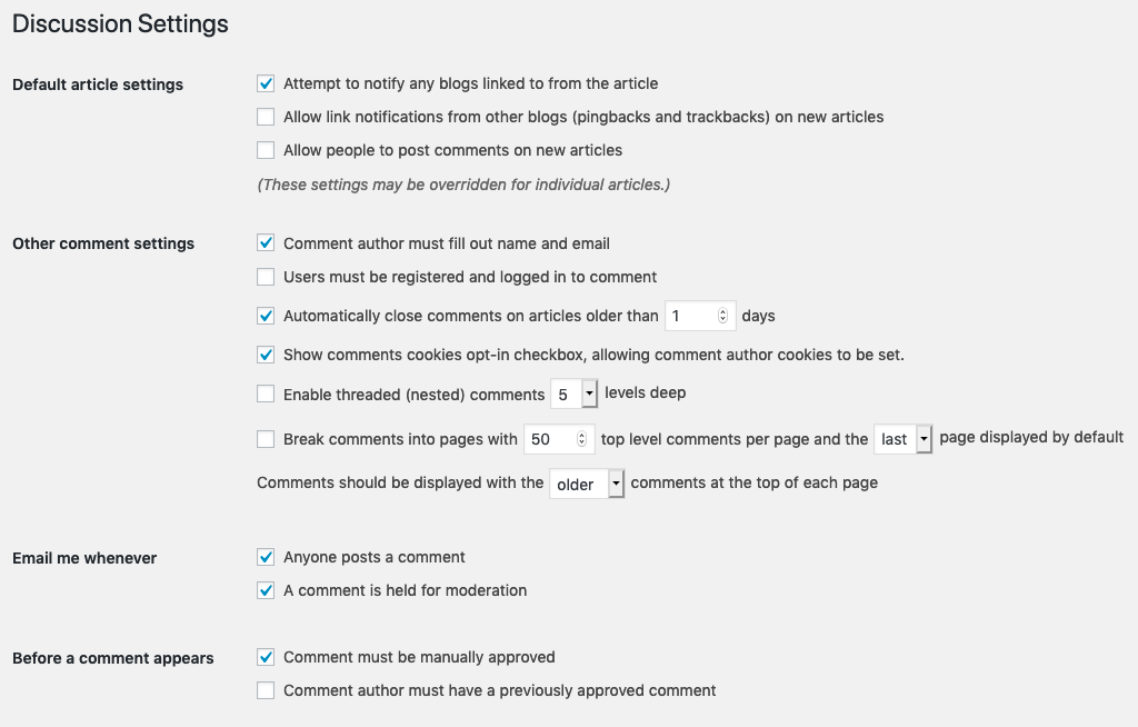
If you aren’t interested in receiving any comments, turn them off in the Discussion settings like this:

Discussion settings for turning off comments in WordPress
Click the image to view it larger. Use these settings if you want to disable future comments on your website.

Option 2: Use Akismet Anti-Spam plugin
If you want to encourage comments — but not spammy ones — install and activate Akismet Anti-Spam plugin. You will also need to choose a plan (free and paid versions available).


2018 in Review: A Big Year

2018 was a wild ride. Here are some of the highlights:

Celebrating Four Years in Business

Flashback to October 2014: I left my full time developer job to go solo. It was the right time to spread my wings and take on the new challenge of creating a business. I had freelanced for years on the side, ever since I graduated college, and it felt like a natural next step to work on my own.

But, as the years passed, I still thought of myself as “just” a freelancer. My inner voice told me I was “trying it out” — even after four years.

In 2018, my mindset changed completely. I fully embraced Lydia Roberts Design as a business and a brand. This new mindset emerged from a few pivotal moments:

New Shared Office and finding Inspiration

In June, I joined a shared office on Depot Street in the River Arts District. This is the biggest shift for me and my business in four years. Having my own desk in this beautifully designed space alongside four talented and creative women, is a dream come true – a dream I didn’t know I had.

I am forever grateful to Casey Nifong for inviting me to join this space. Getting to know her and the other women has been a joy this year. But beyond that, seeing their businesses thrive and grow is a huge motivator for my own business. I’m inspired by their work, their business practices, and their success.

Going Fast…in Vegas

Driving a sports car around a track at 125mph? This was an an experience I never anticipated.

Lydia standing next to an orange McLaren 570s sports car

No big deal, just me and the McLaren

For my husband’s 40th birthday we splurged on a big trip to California with friends. Our finale was a day in Nevada at Exotics Racing Las Vegas. Driving fast cars was at the top of his list — not mine. I was nervous and felt unprepared. I even thought about backing out. But in the end I let go, listened to the instructor…and had an absolute blast.

At the end of the day, I clocked the fastest lap time of our group. I tried something scary and unknown, and loved it. For a risk-averse introvert, this was huge.

I started to think: if I can do this, I can do so much more.

New Work + Services

It was a busy year for website and email work, too.

Sourwood Inn

Custom site for Sourwood Inn

I created a completely custom site for the Sourwood Inn. The Piano Emporium got a custom design to focus on mobile sales. I created a brand new site for River Island Apothecary and guided owner Katie Vie through launching her first online courses on the Pathwright platform. Pamela Millis, LPCS got a completely updated look when we replaced the previous nature stock photos with new professional photography of her and her office. Earlier in the year, I created a new site for Broo using the Divi theme to allow their team to customize their own design. I got to attend an awesome launch party for Hempé. I created the Hempé site in 2017, but this year we updated the site and they began selling through Amazon. Later in the year, I created a new custom homepage for CooperRiis Healing Community, and continue to work with them to improve many areas of the site.

In addition, I worked on countless content updates, Mailchimp templates and consulting, and completed major upgrades to WordPress 5.0 and PHP 7.2.

Flywheel Agency Partner badge

Hosting with Flywheel

This year I also added hosting and maintenance plans as a service. It was a big leap to pay for a large hosting plan, but it’s allowed me to stay in closer touch with clients and be more involved in an on-going way with their online life. I host with Flywheel, an awesome managed WordPress hosting company. Ask me about hosting 🙂

Getting Social

Yep, I finally put my business on Facebook and Instagram. I used to pride myself on flying under the social radar, only to realize I was missing out on a powerful and fun way to express my business. I’m excited to finally join the conversation.

Screenshot of Lydia Roberts Design's instagram grid

I joined the Instagram bandwagon

It was a thrill attending and organizing WordCamp Asheville for the fifth year in a row. My involvement in planning took a backseat this year due to travel and other responsibilities. But, meeting with the organizing team is still one of my favorite yearly pastimes and one I plan to continue.

Group of WordCamp organizers stand smiling in front of 2018 banner

The 2018 Organizing Team

I also had the great opportunity to meet so many colleagues this year as well — through gatherings like The Creative League, and as a side effect of the new office. I am incredibly fortunate to live in such a creative town with such kind people.

Plans for 2019

I have set some big goals for 2019. I aim to expand on my service offerings, while getting more focused on my specific packages. And, I’m finally putting a long-mulled-over idea into action this year, though I’m not quite ready to share what that is 🙂 Stay tuned by signing up for my newsletter and thank you for reading!

I send out helpful web tips, case studies, and things I’m working on.

The New Gutenberg editor from WordPress

Here Comes Gutenberg!

As soon as November 19th, 2018, WordPress will release a major update: version 5.0. With this update will come Gutenberg – a new editing experience for WordPress.

What is Gutenberg?

Gutenberg is a very exciting development in the WordPress world. For years, the page and blog post editor within WordPress has remained virtually unchanged.

Now, with Gutenberg, the editing interface is cleaner and allows for more custom page layouts and styling using blocks.

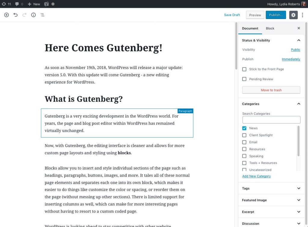
Screenshot of the new editor in action

Here you can see a paragraph Block is highlighted while I write my post

Blocks allow you to insert and style individual sections of the page such as headings, paragraphs, buttons, images, and more. It tales all of these normal page elements and separates each one into its own block, which makes it easier to do things like customize the color or spacing, or reorder them on the page (without messing up other sections). There is limited support for inserting columns as well, which can make for more interesting pages without having to resort to a custom coded page.

WordPress is looking ahead to stay competitive with other website platforms. And, they envision a time may come when the entire website will work using blocks, so that it can be viewed on any kind of device imaginable – not just the phones, tablets, and laptops that we have today. It is a forward-thinking vision and one that I’m truly excited about.


How will Gutenberg affect my WordPress website?

So far, Gutenberg seems to have very good compatibility with the websites I have tested it on. I have not seen any visual issues on sites that I have built. However, I will continue to test, and in the meantime am using the Classic Editor plugin to suppress Gutenberg until my tests are complete.

If your site uses the Divi theme, you may continue to use the Visual Builder to view and create pages. Gutenberg will be available as an option, but you’ll likely continue to use the Visual Builder, since it’s still a much more robust editing experience than Gutenberg.

The general consensus is that Gutenberg will not replace editors like Divi. However, over time there may be many more blocks and custom blocks available from WordPress and independent developers. This means the way we build WordPress sites will continue to evolve, and we have more tools at our disposal to create sites in a way that work best for each individual client — and I love that!


Where can I learn more?

There are lots of resources available that show examples of Gutenberg in action.

Check it out and tell me: are you excited about Gutenberg? Nervous, perhaps?

What do you look forward to doing with Gutenberg editor that you couldn’t do before?

People raise their hands during the opening announcements of WordCamp Asheville 2018

WordCamp Asheville 2018 recap

WordCamp Asheville 2018 is a wrap! It was the fifth WordCamp Asheville and it might be favorite so far. Here are a few of my favorite moments and takeaways from the weekend.

What: WordCamp Asheville, annual WordPress conference
Where: AB Tech Conference Center
When: August 18-19, 2018

Themes & Takeaways

Never Stop Learning

Rachel Cherry’s keynote was a great reminder to never stop learning. Take time each week to read articles, watch relevant videos, or listen to podcasts. Create a block each week to take a deeper dive into a subject, like exploring a new tool, skill, or framework. These deep dives have always been hugely important to me as a freelancer, but I have to admit I’ve let this habit slip the past year. I let myself become busier and busier – sometimes working hard but not working smart – and forgot how much I love exploring articles and learning new tricks.

Tiffany Kutcha’s CSS Grid IRL talk got me excited to take a look at this new layout system. I’ve already spent time this week to learn more about it, and have scheduled a deep dive into this on my calendar!

Just Start

It’s so important to just start instead of waiting for everything to be “perfect.” As a careful and risk-averse person I tend toward analysis paralysis. I let myself get caught up in wanting everything to be just right before starting something new. The fact is, we all start out a new thing a little rough around the edges, and it’s ok to appear unpolished. In fact, people seem to relate and respond well to this “realness” especially on social media. Emily Breedlove’s talk A Roadmap to Social Media Sales Funnels emphasized to get started and then re-evaluate whether you like a certain social media medium. Does it work for your target audience? Do you actually enjoy doing it? Are you good at it, or can you delegate it to someone else?

Aisha Adams told us that it’s ok to take a stance on social issues on social media in her lightning talk 5 tips for increasing engagement via Social Media. I always thought this might turn people off or scare others away. But if done well it can actually bring the right people closer to you.

Take Care of Mental & Physical Health

Over the past couple of years I’ve noticed more speakers getting real about work/life balance and talking about the importance of taking care of mental as well as physical health. A particularly powerful talk is this one from Cory Miller about his own personal challenges and finding support.

In Alisa Herr’s session, Winging it: Starting a WordPress Agency, she talked about starting her own agency with a strong mission and set of principles. She mentioned that among other business challenges like finding the right people for your team and maintaining your values, there’s also the challenge of your own negative self-talk that can come with depression and anxiety. One way she’s made progress is by flipping the perceived negatives into positives: I’m not stubborn, I’m determined. I’m not slow, I’m methodical. I’m not lazy, I find creative solutions. Positive self-talk is something I’m also looking to practice more, and it seems like it keeps popping up everywhere, like this recent video from Daniel Pink.

Along similar lines, John Hornsby’s talk on Sales for the Introverted Designer really struck home in a great way. John covered some great ground rules for customer service, like avoiding “mutual mystifications” — such as using vague wording like “I’ll call you later” or “as soon as I hear back from so-and-so, I will do xyz.” Creating more clarity in our communication, following up, and having a gameplan for how to handle difficult situations like an upset customer is key. Beyond this he talked about how to approach sales in a way that results in you and your client teaming up instead of facing off, and how this creates a win-win for both parties. I love this metaphor and message! I highly recommend checking out his slides.

Apart from the great sessions, we fulfilled one of my WordCamp dreams – donuts for breakfast! My husband is a super volunteer (as are some of the other organizer spouses) so he was tasked with picking up coffee and donuts on Day 2 of the Camp. My friend Lex helped set out food and helped with registration as in years past.

5 Years of WordCamp Asheville

Group of WordCamp organizers stand smiling in front of 2018 banner

The 2018 Organizing Team

As always, getting to be part of an amazing organizing team is the real joy of WordCamp for me. For me, this year was a different, more relaxed experience since I was no longer lead or co-lead organizer. I’m eternally grateful to Laurel Scherer for taking over the lead role! Last year, I felt it was time to let go of the lead and put my focus back on my business, and Laurel stepped right up. The result for me was that this WordCamp was the least stressful and sleep depriving of any prior :). I got to attend Camp without my head spinning full of tasks or stressing about the details. But, the fact that I can still be involved as part of this team means the world to me!

I could ramble on about WordCamp Asheville all day, and if you’re still reading you’re probably thinking “you just did!” This is truly one of my favorite times of year and I’m so grateful to be in this supportive WordPress community.


View all the slides from the sessions I mentioned here:

View Sessions

The Buncombe County Master Gardener Volunteers website screenshot

Buncombe County Master Gardener blog recognized by NC State Extension award

One of my favorite non-profit projects of 2017 was rebuilding the Buncombe County Master Gardener Volunteers website. I was able to refresh the site’s look from a very outdated generic look to a fresher, more garden-y feel. Working with the wonderful women of the master gardeners has been rewarding in many ways, especially the ability to always ask them “What is this plant?!”

The blog is such a valuable resource for area gardeners. It is maintained by a small team of extremely dedicated volunteers who write detailed posts like clockwork. The volunteer writers explain everything from pest management, composting, weed identification, gardening on slopes, pruning trees, and everything else you can think of related to gardening in Western NC. The blog has gained thousands of subscribers over the years thanks to the hard work of the volunteers and their high quality, timely content.

This year, the blog was awarded in the Innovative Project category of the 2018 NC Extension Master GardenerSM (EMG) Search for Excellence!

Congratulations to the dedicated women and men of the BCEMG, especially Barbara Hayes and Beth Leonard, who have made the blog such a huge success over the years.

Here’s an excerpt from the award:

Congratulations! The Buncombe EMGV Blog placed 1st in the Innovative Project category of the 2018 NC Extension Master GardenerSM (EMG) Search for Excellence (SFE).

The EMG SFE is designed to recognize outstanding educational, group projects that result in significant learning. The team that reviewed applications felt the Buncombe EMGV Blog was extremely well-done, provides valuable and timely information to gardeners in western NC, and truly embodies the mission of Extension and the EMG Program.

Visit the Blog

Online Tools to save Time and stay organized

Here are a few tools that have saved me time, effort, and in many cases, sanity.

LastPass (Password Management)

If there’s one tool everyone with an internet connection should have, it’s a password management system. And no, I’m not talking about the notebook where you scrawl down your latest account login or even the massive spreadsheet you’ve been keeping since 1999. A password management tool like LastPass not only saves passwords for you – it can auto-fill them and even auto-fill forms so you never have to write out email address again. LastPass has been saving me oodles of time for over 6 years, and it’s free.

Ublock (Ad Block)

This does just what it says – blocks ads on webpages. Mosto f the time ad block is smart enough to block the bumper ads on YouTube. Want to support a certain site by viewing their ads? Disable ad block on that particular page.

OneTab (Browser Tab Management)

If you spend much of your day on a computer, chances are you have a bit of browser tab buildup. That’s right, I’m talking about the 87 tabs currently open in your browser (oh, maybe that’s just me!). Don’t lose your tabs ever again and keep them organized into groups, or tuck them away to clear the clutter. This little browser extension has made a big difference in my workflow!

JumpCut (Copy/Paste helper, Mac Only)

JumpCut allows you to see the last several items that you copied to your “clipboard” (the magical space where things go when you copy a piece of a text and get ready to paste it). This is super useful when you need to copy/paste lots of stuff all the time like me! This way you can copy several pieces of text in a row, and retrieve them in JumpCut.

Bear (Notes)

Everyone has their favorite note-taking app, and Bear is mine. Bear lets you write in markdown which makes it easy to write for your website and paste it in without losing formatting. It also syncs with all devices if you use the paid version (~$15/yr). I mainly like the way everything is tagged and organized, and it looks super clean. SimpleNote came close but I love Bear!

I’m always looking for little web helpers, and I’ll be sure to share them here. I hope these tools are useful for your online workflow!

Last updated: October 2019