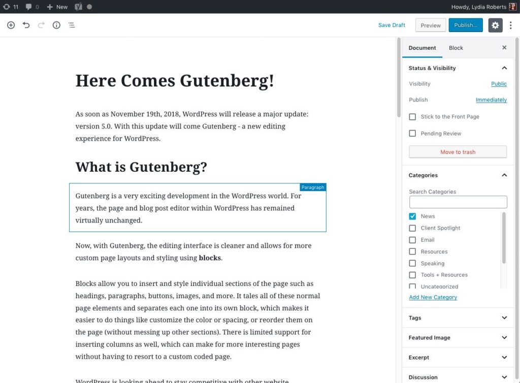
Gutenberg — the new block editor from WordPress — was released in late 2018. I’ve now had the opportunity use it on several sites, and these are my initial thoughts about it. Please note this post is more designer/developer focused. For more of a general overview about the block editor, please read my previous post, Here Comes Gutenberg.
What I Like about Blocks…
Columns
Layouts that previously would have required a custom template can now be created in minutes. The primary example is the columns block. I especially love being able to use columns at will without resorting to customizing a child theme or creating a special page template.
con: The columns appear very narrow in the editor and it can be hard to drag blocks in and out of the column areas. If you use a bullet list inside columns, it starts to look pretty bad in the editor because there is not enough width to show the text without wrapping. All the content is smushed together.
Galleries
The gallery block is really nice. I like that it can be adjusted just like the old WordPress gallery to be multi- or single-column, link to the images or not. It’s a nicer visual representation of what the gallery actually looks like, whereas in the classic editor, it could often look nothing like the real gallery depending on the theme.
con: You need to install a plugin like WP Featherlight to make the images pop up in a lightbox when clicked, as far as I can tell. It would be nice if this was just built in to the gallery block as an option to turn on or off.
HTML block
As a developer it’s amazing to have a block just to insert custom code, if I need to add a very specific area to a page that needs to look “just so”, or maybe I need to insert a widget from a third party in javascript. Previously, this was a big problem because custom code could be hidden or easily edited/overwritten in the visual editor. This way it’s more protected and separate.
con: I’ve noticed several times that if invalid HTML is detected, the block shows a warning and allows you to expand a window showing the errors. The interface for fixing the html is super confusing and reminds me of the draft history interface, where nothing seems to be editable. I might be missing something here, but so far this has thrown me for a loop.
Classes
Possibly my favorite feature is the ability to add css classes on any block, in the Advanced area. Like the HTML block, this allows me as a designer to add specific styles to headings, paragraphs, or really any other area, without it being in danger of getting lost when the text is edited.
Re-usable Blocks
I haven’t used this nearly as much as I thought I would, but I still love that it is an option.
Pet Peeves
The way inline images work is just plain confusing, and I’m not sure I “get it” enough to even write much about it here. This was one of the most useful features of the old editor, so to see it degrade here is really unfortunate. Inline doesn’t gel very well with blocks, and it seems like once an image is inserted inline, it can’t be edited, only removed. What am I missing here?
A lot of the UI (user interface) elements don’t show up until you hover or click inside of a block. This is kind of cool, because it makes the whole view cleaner as you’re working. But it also makes it really hard to delete a block – you have to click in the block, click again on a three dots for “more” and then “Remove Block”. It can make deleting something simple like a button take way longer than I feel it should.
The whole editing window is much narrower than the classic editor. I think this is because some themes allow for full width images/content areas, so it helps show the difference between the normal width (narrow) and full width (wide). But many themes don’t have this ability and it’s annoying that the editor can’t be adjusted to be wider. See my above comment about how columns appear smushed together because they are so narrow.
Thumbs up for now
Overall, I think Gutenberg is a big step in the right direction, and it was needed. The ability to use columns alone, without a plugin, is huge.
There is definitely great room for improvement, but I’m already looking forward to updating existing sites to use more of Gutenberg and less of custom fields or plugins that are becoming obsolete. It’s already changed the way I think of laying out pages, and is making building a site easier and more flexible.


